Branding & Menus
Restaurant Color Schemes (and Why Color Alone Won't Fill Seats)

By Daniel Ruiz, former NYC chef July 2026 11 min read
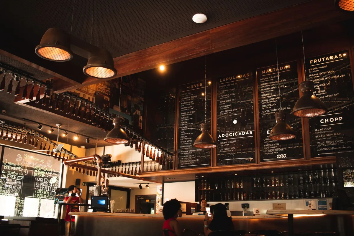
You choose a restaurant color scheme by starting with your crowd and your cuisine, not your favorite color. Pick one or two signature colors plus a couple of neutrals, let the mood match the guest you're built for, and make sure it reads in dim light and on a phone. That part is real, and I'll walk you through all of it.
But here's the thing I need you to hear before we get into palettes: color alone won't fill your seats. A gorgeous color scheme bolted onto a restaurant whose font, room, menu, and staff all say something different just reads as confusing, and confusion is the opposite of loyalty. Color is the anchor. The win comes when everything else moves in unison with it. I spent over a decade in NYC kitchens, line cook to executive chef, before I became a marketer, and this mismatch is the single most common branding mistake I watched play out from the pass.
Just want palette examples by restaurant type? Skip to them ↓
Why color alone won't fill seats
Let me start where most articles end, because it's the whole point. Owners come to color scheme thinking of it like paint: pick nice colors, slap them on the walls and the logo, done. But a guest doesn't experience your color scheme in isolation. They experience your restaurant as one continuous feeling, and color is just the first note. If the palette says "warm, rustic, come sit a while" but the font on the menu is a cold corporate sans-serif, the lighting is flat fluorescent, and the server greets them like a call-center script, the brand contradicts itself. The diner can't tell what the place is, so they don't fall in love, and they definitely don't tell their friends.
So think of your color scheme as the anchor, not the answer. It's one of the strongest signals you've got, because color is the very first thing the eye registers, before a single word gets read. But its job is to set a direction that everything else then agrees with: your fonts, your room, your menu design, your plating, your website, your music, even the tone your staff use when they talk to a table. When all of it points the same way, a guest feels it instantly, before the food ever lands, and that feeling is what actually fills seats. Color is where you start. Unison is where you win. Keep that in your head through everything below, and we'll come back to it hard in a minute.
This is really one slice of a bigger picture. If you want the full foundation, our guide to restaurant branding ideas zooms all the way out. This post drills into the color layer specifically, and how to keep it from drifting out of sync with the rest.
Start with your crowd, not your taste
Almost every color conversation starts in the wrong place: someone opens a design app, pins colors they personally think are pretty, or copies a spot they admire in a different city serving a totally different crowd. That's backwards. Your favorite color is irrelevant. The only thing that matters is the guest you're building this place for, and whether the palette speaks their language the second they find you.
And you don't need a single customer yet to know this. If you're still pre-opening, you already know the important part: the food you're going to cook, the price point, the kind of night you want people to have. All of that already describes a person. A natural-wine bar with a vinyl-only playlist is built for a very different guest than a wings-and-ten-TVs sports bar, and each one calls for a completely different palette. So get uncomfortably specific about that guest first: their age, their budget, why they're eating out, what would make them feel out of place. Once you can picture them clearly, the color questions stop being guesswork and start being translation. You're not asking "what do I like," you're asking "what makes this person feel at home." That's a question with an answer.
What colors actually say to diners
Color carries meaning before language does, and diners read it without thinking. You don't need a psychology degree, you just need to know the broad strokes so you're choosing on purpose instead of by accident. Here's the honest, practical version:
- Warm tones (reds, oranges, terracotta, deep yellows) feel energetic, appetizing, and social. They read cozy and comforting, which is why so many family spots, Italian rooms, and burger joints live here. Warm colors are inviting and a little stimulating, great for a lively, high-turn room.
- Cool tones (deep greens, navy, charcoal, slate) read calm, refined, and grounded. They're the natural home of upscale, cocktail-forward, and modern concepts, where you want the mood to feel considered and unhurried.
- Earthy neutrals (cream, sand, kraft brown, olive) feel honest, natural, and handmade. They suit farm-to-table, bakeries, cafés, and anywhere "real and unfussy" is the promise.
- Light, airy palettes (off-whites, soft pastels, pale greens) read fresh, clean, and healthy, which is why cafés, brunch spots, and health-forward fast-casual lean this way.
- High contrast and neon (black with electric pink, cyan, or lime) read loud, young, and fun. This is bar, late-night, and bold street-food territory, where standing out beats being soothing.

One caution, since it comes up: don't overthink the "red makes people hungry" folklore. There's some truth that warm colors feel appetizing, but no palette overcomes a room that contradicts itself. Use these as a starting compass for matching mood to crowd, not as a magic formula. The goal is a palette that feels like your guest, then a whole restaurant that agrees with it.
How to build a scheme (the 60-30-10 rule)
Once you know the mood, building the actual palette is refreshingly simple, and the biggest mistake is using too many colors, not too few. A clean restaurant scheme is usually just one or two signature colors plus one or two neutrals. That's it. A rainbow reads as chaos and is impossible to keep consistent across a sign, a menu, and a phone screen.
A designer's trick that keeps things balanced is the 60-30-10 rule. Roughly 60% of what a guest sees is your dominant color (often a neutral, think walls, tablecloths, the bulk of your menu paper). Roughly 30% is a secondary color that supports it. And about 10% is your accent, the punchy signature color you use sparingly for the logo, a feature wall, buttons on your site, the thing the eye jumps to. Keeping your loudest color to that 10% is exactly why it stays special instead of exhausting. Build in that proportion and even a bold palette feels intentional and calm.
Two more rules on top of the ratio. First, pick colors that hold their meaning across materials, a shade that looks rich on a designer's monitor can turn muddy on a printed menu or dull on a painted wall, so check it where guests will really see it. Second, once you lock the palette, write the exact values down (the specific hex and, if you print, the ink codes) and hand that to everyone who ever makes something for you. That one document is what keeps your color from quietly drifting five different directions across your sign, menu, and Instagram.
Want a brand that actually moves in unison?
Picking colors is the easy part. Getting your palette, fonts, menu, and whole feel to point the same direction is the work, and it's exactly what we do, led by a former NYC chef who's seen it from both sides of the pass.
Color schemes by restaurant type
Here's the abstract stuff made concrete. Below are six starting palettes mapped to common concepts. These aren't rules, they're a map, find the row closest to your crowd and use it as a launch point, then make it yours. Notice how each one is just a couple of signature colors plus neutrals, exactly like we talked about.
Cozy neighborhood Italian
Warm terracotta and olive over cream, grounded in near-black. Feels rustic, generous, and lived-in, the crowd that orders a second bottle.
Upscale steakhouse
Oxblood and charcoal with a brass accent and warm white. Reads refined, moneyed, and unhurried, a date-night, special-occasion room.
Coastal café / brunch
Seafoam and coral over sand and off-white. Light, fresh, and social, built for daytime, sunshine, and a phone camera.
Late-night bar / street food
Black with electric pink and cyan. Loud, young, and high-energy, the crowd doing shots before the place next door.
Health-forward fast-casual
Leaf green and kraft tan on charcoal and white. Clean, natural, and fast, for the lunch crowd that wants to feel good after.
Natural-wine / minimalist
Muted clay and sage over bone and ink. Understated, design-forward, and quiet, for the crowd that photographs the plate.
See the pattern? Every single one is disciplined: two colors that carry the mood, one or two neutrals doing the heavy lifting, and the loud color used sparingly. That restraint is what makes each of them feel like a real, confident brand instead of a paint sample gone wrong.
Make everything move in unison (this is the real work)
Now back to the promise from the top, because this is the part that actually separates a memorable restaurant from a forgettable one. A color scheme only pays off when everything else in the building agrees with it. Picking the palette is maybe a fifth of the job. Getting the whole brand to move in unison with it is the other four fifths, and it's where most places fall apart.
So once your palette is set, walk your restaurant like a guest and make each of these speak the same language:
- Your fonts. Type is the voice that sits right next to your color. A hand-scrawled font and a cool navy palette send opposite signals. Pick lettering whose personality matches the mood the color set, playful with playful, refined with refined.
- The room. Lighting, chairs, walls, and materials have to carry the palette off the logo and into three dimensions. Warm, cozy colors under flat white light is an instant contradiction a guest feels the second they walk in.
- The menu. This is the one operators most often forget. Your menu design, its paper, colors, and type, is the brand asset guests spend the most time actually holding. If it doesn't match the palette, the mismatch is in their hands for the whole meal.
- The plating and tableware. The plates, glassware, napkins, and even the food styling live inside your color world too. A rustic warm brand plated on stark clinical white can feel oddly off, though this one's the most flexible, so use judgment.
- Your logo and signage. Your logo is the sharpest expression of the palette. It should use the scheme and still read in one flat color on a to-go cup or an awning across the street.
- Your website and social. The digital front door has to match the physical one. When someone finds you online, the colors, type, and mood should be the same restaurant they'd walk into, or the disconnect quietly costs you the reservation.
- Even how your staff talk. This sounds abstract but guests feel it. A refined, quiet color scheme paired with loud, over-familiar table service is a mismatch, and so is a fun, casual palette paired with stiff, formal servers. The tone of the service is part of the brand, and it should match the feeling your colors promise.

You don't have to fix all of this at once, and you won't. But you do have to hold the standard: every touchpoint either reinforces the brand or undercuts it, and the brand is only as strong as its weakest one. A perfect palette can still feel "off" because one loud detail is fighting the rest. Get them all pointing the same direction and the whole place clicks into focus.
Will it survive dim light and a phone screen?
One practical gut-check before you commit, because it's where beautiful palettes go to die. A color scheme has exactly one job, to work where your guests actually see it, and that's rarely a bright designer's monitor. It's a dim dining room at 8pm, a sign read from across a dark street, and a phone screen at arm's length. Test your palette in all three.
The usual failure is contrast. Two colors that look distinct and elegant in daylight can collapse into an unreadable smudge under warm restaurant lighting, and a menu with pale ink on a slightly-less-pale background is a nightmare the moment the lights go down. Make sure your text always has strong contrast against its background, check the whole thing on a phone (since that's where most people first meet your brand), and glance at your sign after dark. A palette that looks stunning in the pitch and disappears on your storefront at night has failed at the one thing it was for. Pretty is a bonus. Legible is the requirement.
Color scheme mistakes that quietly cost you
- Starting with your favorite color instead of your crowd. The palette isn't about your taste, it's about making your guest feel at home. Choose for them.
- Using too many colors. A rainbow reads as chaos and is impossible to keep consistent. Two signatures plus neutrals, kept to the 60-30-10 balance.
- Letting the palette drift. The sign, the menu, and the Instagram feed slowly wander into three different versions of "sort of red." Write down the exact color values and make everyone use them.
- Picking colors that don't survive the room. Gorgeous on a monitor, muddy on the wall or invisible in dim light. Always test where guests will really see it.
- Nailing the color and forgetting everything else. The big one. A great palette with a mismatched font, room, menu, or service tone still feels confused. Get the whole brand in unison.
Key takeaways
- Color is the anchor, not the answer. A great palette won't fill seats on its own, the whole brand has to move in unison with it.
- Start with your crowd and cuisine, not your favorite color. The palette's job is to make your guest feel at home.
- Keep it disciplined: one or two signature colors plus neutrals, balanced roughly 60-30-10.
- Match everything to the palette: fonts, the room, the menu, plating, logo, website, and even how your staff talk.
- Test it where guests see it: dim light, a sign after dark, and a phone screen. Legible beats pretty.
Frequently asked questions
How do I choose a color scheme for my restaurant?
Start with the guest you're built for and your cuisine, not your favorite color. Decide the mood that fits that crowd (cozy, refined, fresh, loud), then pick one or two signature colors plus one or two neutrals to carry it. Balance them roughly 60-30-10, and test the palette in dim light and on a phone before you commit. The colors should make your guest feel at home the second they find you.
What colors are best for a restaurant?
It depends entirely on your crowd and concept. Warm tones (reds, oranges, terracotta) feel cozy and appetizing and suit family and comfort spots. Cool tones (deep greens, navy, charcoal) read refined and modern for upscale rooms. Earthy neutrals suit farm-to-table and cafés. High-contrast and neon read loud and young for bars and late-night. Match the mood to the guest, then keep the palette to one or two signature colors plus neutrals.
How many colors should a restaurant brand use?
Usually just one or two signature colors plus one or two neutrals, no more. A common trap is using too many colors, which reads as chaos and is impossible to keep consistent across a sign, a menu, and a phone screen. The 60-30-10 rule helps: about 60% dominant (often a neutral), 30% secondary, and 10% your punchy accent used sparingly so it stays special.
Does color scheme really affect restaurant sales?
Color influences the mood and first impression, and warm colors do tend to feel appetizing, but color alone won't fill seats. What actually drives loyalty is a brand that feels united: the palette, fonts, room, menu, plating, and even the tone of service all pointing the same direction. A beautiful color scheme surrounded by mismatched details reads as confusing, and confusion is the opposite of a guest who comes back.
How do I keep my restaurant colors consistent everywhere?
Lock the exact color values once (the specific hex codes, plus ink codes if you print) and write them into a simple one-page brand sheet. Hand that to anyone who ever designs your menu, sign, packaging, or social posts. Without it, your colors slowly drift into several slightly different versions across touchpoints, which quietly weakens the brand. One source of truth keeps everything matching.
Should my menu and website match my restaurant's colors?
Yes, absolutely. The menu is the brand asset guests hold the longest, and your website is often the first place they meet you, so both need to carry the same palette, type, and mood as the room. When the digital and printed touchpoints match the physical space, the whole experience feels like one confident restaurant. When they don't, the disconnect quietly costs you reservations and repeat visits.