Branding & Menus
Restaurant Branding Ideas That Make You Unforgettable

By Daniel Ruiz, former NYC chef July 2026 12 min read
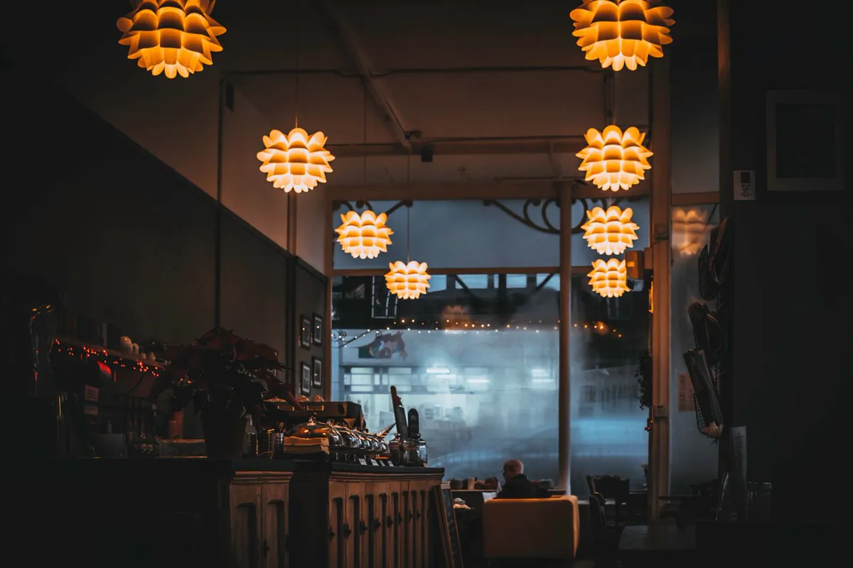
The best restaurant branding ideas don't start with a logo or a color you like. They start with the person you're building the restaurant for. Your brand is the feeling a guest gets before the food ever lands: the crowd you serve, the food and drinks you pour, the room, the menu, the music, the way your name is written. When all of that points one direction, you become unforgettable. When it doesn't, a beautiful logo can't save you.
Here's why I can help you get this right. I spent over a decade in New York City kitchens, from line cook to executive chef, so I watched branding get decided from the inside, night after night. Then I crossed over and became a restaurant marketer, which is what I do now. That combination is the whole point: I saw the mistake operators make from the kitchen side, and now I fix it from the marketing side. This is the operator-to-operator version of how to build a brand from the inside out.
The branding mistake I watched on repeat
Here's the thing I saw again and again from the kitchen side of the pass. An owner would have a crystal-clear picture in their head of the crowd they wanted. They'd want the well-dressed date-night couples, the people ordering a second bottle, the Instagram crowd that turns a Tuesday into a scene. They'd run a special built for that fantasy: a fancy tasting night, a "craft cocktail" push, a high-end prix fixe.
And then you'd look up from the line and the room just didn't match the dream. The lighting was fluorescent and flat. The chairs were the ones that came with the space. The menu was a laminated sheet with clip-art borders and dollar signs on every line. The playlist was a phone on shuffle. The name over the door said one thing and everything underneath it said another. The food was often genuinely good, so that was never the problem. The problem was that the guest walked in expecting one experience and got a completely different one, and confusion is the opposite of loyalty. People couldn't tell what the place was, so they didn't come back, and they definitely didn't tell their friends.
Back then, as a chef, I didn't have a vote in any of that. Now, as a marketer, it's the first thing I fix, and that kitchen-side view is exactly why I catch it fast. So here's the whole point of this guide: branding is not your logo. Your logo is maybe five percent of it. Branding is the core of your restaurant: who it's for, what it serves, how the room feels, how the menu reads, what happens when the food hits the table. It all comes together, or it all falls apart together. A gorgeous logo bolted onto a confused restaurant is lipstick on a place that doesn't know what it is. So before we get to colors and fonts, and we will, in detail, we have to talk about the foundation everything else sits on.
Start with who you're built for, not the color you like
Almost every branding conversation starts in the wrong place. Someone opens a design app, or pins colors they think are pretty, or copies the aesthetic of a spot they admire in a totally different city serving a totally different crowd. That's backwards. Your favorite color is irrelevant. The restaurant down the block that you're low-key jealous of is irrelevant. The only thing that matters is the guest you're building this place for, and whether every choice you make speaks their language.
And to be clear, you don't need a single customer yet to know this. If you're still pre-opening, you already know the important part: the food you're going to cook, the drinks you're going to pour, the price point, the music you want playing, the kind of night you want people to have. All of that already describes a person. A natural-wine bar with a vinyl-only playlist and small plates is built for a very different guest than a wings-and-ten-TVs sports bar, and you knew which one you were building long before you signed the lease. Branding is just making that person feel, the second they find you, that you built the place for them.
So get specific about that guest, uncomfortably specific. Not "everyone." Nobody is built for everyone, and a brand that tries to please everyone reads as bland to each of them. Are you the neighborhood spot where the same forty-to-sixty-year-old regulars come three nights a week and want to feel at home? Are you the loud, cheap, late-night place packed with twenty-two-year-olds doing shots before the bar next door? Are you the design-forward date-night room where people are secretly there to photograph the plate? Are you the fast, healthy lunch counter for people who have forty minutes and want to feel good after? Each of those is a completely different brand, and the guest decides which one you are.
Once you can picture that person clearly, their age, their budget, why they're eating out, what they'd post, what would make them feel out of place, every hard branding question suddenly gets easier. Should the type be a hand-scrawled graffiti font or a refined serif? Depends on the guest. Warm and cozy or stark and modern? Depends on the guest. Loud neon sign or a quiet painted logo? Depends on the guest. You're not guessing anymore. You're translating one clear person into a hundred small decisions. That's what branding actually is.
Three questions to answer before you touch a color
Before a single design decision, sit down and answer these three, honestly and out loud. If you can't, you're not ready to pick colors. You're ready to have a harder conversation about what your restaurant really is. Everything visual flows out of these answers.
Who are you built for?
The guest you want in the room, whether you're open or still pre-opening. Their age, budget, and why they're out. Everything you design has to make that person feel like the place was made for them.
What are you serving?
The food and the drinks. Natural wine and small plates, a smash-burger counter, and a shot-and-a-beer bar are three different worlds. The menu is the brand.
How should it feel?
The one word a guest should use for the vibe: cozy, wild, refined, honest, fun. Pick the word first, then make every choice earn it.
Notice that none of those three is "what's my logo?" The logo is a downstream decision. It's how you express the answers, not how you find them. Get these right and the visual choices practically make themselves. Get them wrong and no designer on earth can fix it, because they'd be dressing up a restaurant that doesn't know who it's talking to.
Read the room: crowd to brand direction
Here's where it gets concrete. Once you know who you're serving, you can translate that crowd into a direction: the general feel, and the color and type cues that carry it. This isn't a rulebook, it's a starting map. The point is the logic, where the crowd on the left drives everything on the right. Find the row closest to your guest and let it point you.
| Your crowd | What the brand should feel like | Color & type cues |
|---|---|---|
| Young, trend-driven, in-the-know (the "hipster" set) | Raw, unpolished, a little in on the joke | Hand-drawn or graffiti type, black-and-white or acid brights, exposed and industrial |
| Families and 40–60 neighborhood regulars | Warm, dependable, feels like home | Classic serif or friendly type, warm earthy tones, soft and unfussy |
| Upscale date-night and special occasions | Refined, restrained, quietly confident | Elegant serifs, muted or dark palette, lots of whitespace |
| College and late-night bar crowd | Loud, fun, cheap-and-cheerful | Bold sans or display type, neon and high contrast, punchy and playful |
| Health-minded daytime café crowd | Fresh, clean, honest | Light and airy, natural greens and creams, simple sans, plenty of white |
| Craft-cocktail and natural-wine seekers | Design-forward, intentional, discovery-worthy | Distinctive display type, moody or unexpected palette, clearly art-directed |
Read down the "hipster" row and then the "date-night" row and you can feel how far apart two great restaurants can be, and why borrowing one's look for the other's crowd would flop. This is exactly where I watched owners go wrong. They'd pick the look from the row they wished they were in instead of the one their actual guests live in. Be honest about your row first. You can always grow into a different one later, but you have to nail the guest you have tonight.
Your food and drinks are branding too
This is the part people forget, and it's the part I feel most strongly about after all those years on the line. Your menu is not separate from your brand. It might be the loudest branding you have. It's the one thing every single guest reads, top to bottom, while they're hungry and deciding. What you serve, how it's cooked, how it's plated, how it's described, and what it costs all tell the guest who you are, often before they've noticed the logo at all.

So the food has to agree with everything else. A "refined, upscale" brand with a menu full of clip art, dollar signs, and forty options isn't refined, it's confused, and guests feel the mismatch even if they can't name it. A raw, industrial, cool-kid brand with a stiff, formal, leather-bound menu feels like it's trying too hard. The drinks tell the story too: a serious craft-cocktail list, a tight natural-wine selection, or a wall of two-dollar-shot specials each broadcast a completely different identity and pull in a completely different person. Decide what the drinks are saying on purpose.
This is why, when I build a brand, the menu is never an afterthought. It's the center of gravity. Getting the menu's look, language, and pricing to match the rest of the brand is some of the highest-leverage work there is, and it's where a chef's eye actually helps. If you want to go deep on that specific piece, I wrote a whole guide on menu design ideas that make diners order more, and a companion one on how to price a menu so you actually make money. Both are branding documents as much as they are operations documents.
Know your crowd but can't get the brand to match it?
Pulling your crowd, cuisine, room, and menu into one brand that actually fits is careful work. If you'd rather hand it to someone who's worked the line and knows how it all comes together, that's exactly what we do.
Color: what your palette says before you speak
Now the fun stuff, and notice we only got here after the foundation. Color is powerful because it's the first thing the eye registers, before a single word, and it sets a mood instantly. The trick is to let your crowd and your vibe choose the palette, not your personal taste.

A few honest guardrails that hold up across restaurants:
- Warm tones invite and comfort. Reds, oranges, warm yellows, deep browns and terracottas feel cozy, appetizing, and energetic. They're a natural fit for family spots, casual comfort food, and anywhere you want people to feel warm and stay a while. Warm reds and oranges are also famously appetite-friendly, which is why so many food brands live there.
- Cool and muted tones read calm and upscale. Deep greens, navy, charcoal, and soft neutrals feel refined, modern, and a little quieter. They suit date-night rooms, cocktail bars, and design-forward concepts where restraint is the statement.
- High-contrast and neon read loud and young. Black-and-white with one electric accent, or full-on neon, feels bold, fun, and current. Perfect for late-night, bar, and trend-driven crowds, and a strange fit for a quiet neighborhood dinner spot.
- Light, airy, natural palettes read fresh and honest. Creams, soft greens, and lots of white space feel clean and healthy, ideal for cafés, daytime, and anything that wants to say "good for you" without shouting.
Two practical rules on top of the mood. First, keep your core palette tight: one or two signature colors plus a neutral or two, not a rainbow. Second, make sure it's actually readable, in dim restaurant lighting, on a sign across the street, on a phone screen. A palette that looks stunning on a designer's monitor and disappears on your storefront at night has failed at the one job it had. Pick colors that work where guests will really see them. For the full walkthrough on this one piece, see how to build a restaurant color scheme that ties the whole brand together.
Fonts: your voice in letterform
If color is your mood, type is your accent. It's how your restaurant "sounds" without saying a word. Most people underrate this, but the shape of your letters tells guests whether you're old-school or modern, fancy or friendly, careful or carefree, all before they read the actual words. Same rule as always: the crowd and the vibe pick the type.
- Serif type (the letters with little feet) reads classic, established, and trustworthy. It's a natural voice for heritage spots, steakhouses, fine dining, and anywhere "we've been doing this a long time and we do it right" is the message.
- Clean sans-serif type reads modern, simple, and approachable. It suits contemporary concepts, cafés, fast-casual, and health-minded spots, anywhere clarity and ease are the vibe.
- Display, script, and hand-drawn type is where personality lives, including that graffiti, spray-paint energy for a young, urban, cool-kid crowd, or a warm handwritten script for a homey bakery. Use it as your headline voice, the thing people remember, but use it in small doses.
Two guardrails that save you from the most common type mistakes. First, pick one or two fonts and stick with them: a display font for your name and headlines, a plain, readable font for everything else. Three or four competing fonts make a restaurant look chaotic and amateur. Second, legible beats clever, always. The most beautiful, on-brand font in the world is a liability if a guest can't read the menu by candlelight without their glasses. Your personality font goes on the sign and the headers, the workhorse readable font carries the menu and the details. Get that division right and your type does real branding work without ever getting in the guest's way.
The name and logo (yes, they matter, just later)
I've spent this whole guide telling you the logo isn't the brand, and I stand by it. But it's still the flag everyone salutes, so once the foundation is set, get it right. The good news is that when you've already nailed your crowd, cuisine, feel, colors, and type, the name and logo almost design themselves, because they're just the sharpest expression of decisions you've already made.
Your name should be easy to say, easy to remember, easy to spell when someone's searching for you at 7pm, and it should hint at what you are. Your logo should be simple enough to work everywhere it has to live, from the sign to a coffee cup to a to-go bag to a tiny social avatar to a single color stamped on a napkin, and it should carry the type and color decisions you already made. I've written full companion guides on both, so I won't repeat them here: restaurant name ideas and how to pick the right one, and restaurant logo ideas that don't look cheap. Read those when you're ready to lock the flag down. Just don't start there. Start with the seat.
A brand lives everywhere, or nowhere
Here's the idea that ties the whole thing together and separates unforgettable restaurants from forgettable ones: a brand is the sum of every touchpoint, and it's only as strong as its weakest one. You can have a perfect logo and a beautiful color palette and still feel off, because a guest experiences your brand as one continuous thing, and one jarring detail breaks the spell.

So walk your restaurant the way a first-time guest does and ask, at every step, "does this say who we are?" The sign and the storefront. The front door and the host stand. The lighting and the music (and genuinely, the playlist is branding, because a random shuffle undoes a carefully built mood in one wrong song). The menu, in look and language and price. The plates and the plating. The staff, because how they're dressed and how they talk to a table is your brand speaking out loud. The to-go packaging and the bag it leaves in, which is a tiny billboard walking down the street. And then the online half of the room, which for most guests is the first touchpoint: your website, your Google listing, your photos, your social feed. If the website looks nothing like the room, or the photos are dim and inconsistent, the brand fractures before anyone even shows up.
None of this has to be expensive. Consistency is mostly about intention, not budget. A taqueria and a tasting-menu spot can both be perfectly, unforgettably on-brand at wildly different price points. The magic is simply that everything points the same direction. When the sign, the room, the menu, the plate, the playlist, the packaging, and the website all whisper the same word to the guest, that word sticks. That's how you become the place someone describes to a friend in one sentence, which is the only branding that actually fills seats.
Branding mistakes that quietly cost you
A few traps I've seen sink otherwise great restaurants. None of them are dramatic. They just quietly leak guests and loyalty.
- Chasing the crowd you want instead of branding for the one you have. The mistake from the top of this guide. Build for your real guest first, then you can evolve later.
- Copying the hot spot down the block. Their brand fits their crowd and their food, not yours. Borrowed identity always reads as a knockoff.
- Trend-chasing. The ultra-trendy look of this year ages fast and dates your place. Aim for a brand that's true to you, not one that's momentarily cool.
- A brand that fights the food. Fancy branding on comfort food, or scrappy branding on genuinely fine dining, confuses guests about what to expect, and confused guests don't return.
- Inconsistency. A great logo, and a website, menu, and dining room that all look like they belong to different restaurants. One weak touchpoint drags the whole brand down.
- Treating the logo as the finish line. The logo is the start of expressing your brand, not the end of building it. The real work is everything the logo touches.
Key takeaways
- Branding is not your logo. It's who you serve, what you serve, how the room feels, and how the menu reads, all pointing one way.
- Start with the seat. Get uncomfortably specific about the guest you're built for, even before you open, before you pick a single color or font.
- Let the crowd choose the cues: graffiti and neon for the young and loud, muted serifs for the refined, warm and classic for the neighborhood regulars.
- Your menu and drinks are branding, often the loudest you have, so make them agree with everything else.
- A brand lives everywhere or nowhere. Sign, room, plate, playlist, packaging, and website all whispering the same word is what makes you unforgettable.
Frequently asked questions
What is restaurant branding, really?
Restaurant branding is the whole experience and identity of your restaurant: who it's built for, what it serves, how the room feels, how the menu reads, the colors, the type, the name, and every touchpoint a guest meets. It's the feeling someone gets before the food even arrives. The logo is just one small expression of it, not the brand itself.
How do I choose a brand for my restaurant?
Start with the guest you're building for, not with a color or logo. You don't need existing customers to know this: your food, drinks, price point, and vibe already describe a person. Get specific about that person, their age, budget, and why they're eating out, then decide how the place should feel in one word. Once those are clear, the colors, fonts, name, and logo follow naturally, because they're just how you express decisions you've already made.
Should I pick my colors and logo first?
No. That's the most common branding mistake. Colors and logos are downstream decisions. If you pick them before you know your crowd, your cuisine, and your vibe, you're guessing, and no logo can fix a brand that doesn't know who it's talking to. Nail the foundation first, then the visuals practically design themselves.
What colors are best for a restaurant?
It depends entirely on your crowd and vibe. Warm tones (reds, oranges, browns) feel cozy and appetizing and suit family and comfort spots. Cool, muted tones (greens, navy, charcoal) read refined and modern for upscale or cocktail concepts. High-contrast and neon read loud and young for bars and late-night. Light, airy, natural palettes read fresh for cafés. Keep your core palette to one or two signature colors plus neutrals, and make sure it's readable in dim light and on a phone. See our full guide to restaurant color schemes for palettes by concept.
Is the menu part of restaurant branding?
Absolutely, it may be your loudest branding. The menu is the one thing every guest reads top to bottom while deciding, so its look, language, and pricing tell people who you are, often before they notice the logo. A menu that clashes with the rest of your brand (a fancy concept with a clip-art menu) confuses guests. Getting the menu to match the brand is some of the highest-leverage branding work there is.
How much does restaurant branding matter if the food is great?
Great food gets people in once. Branding is a big part of what gets them back and gets them talking. When your brand is clear and consistent, guests know exactly what you are, feel at home, and describe you to friends in one sentence, and that's what fills seats over time. When the brand is confused, even great food struggles, because people can't tell what the place is or who it's for.